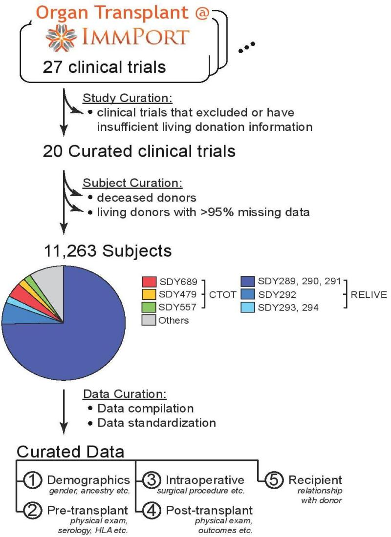
Post-donation clinical observation trajectory network for Living Kidney Donors
Powered by ImmPort
If any part of the data is used, please cite the following:
Chen J, Bhattacharya S, Sirota M, Laiudompitak S, Schaefer H, Thomson E, Wiser J, Sarwal MM, Butte AJ. Assessment of Postdonation Outcomes in US Living Kidney Donors Using Publicly Available Data Sets. JAMA Netw Open. 2019 Apr 5;2(4):e191851 PMID: 30977847
The immTransplant flat data files are available for download: ImmTransplant GitHub
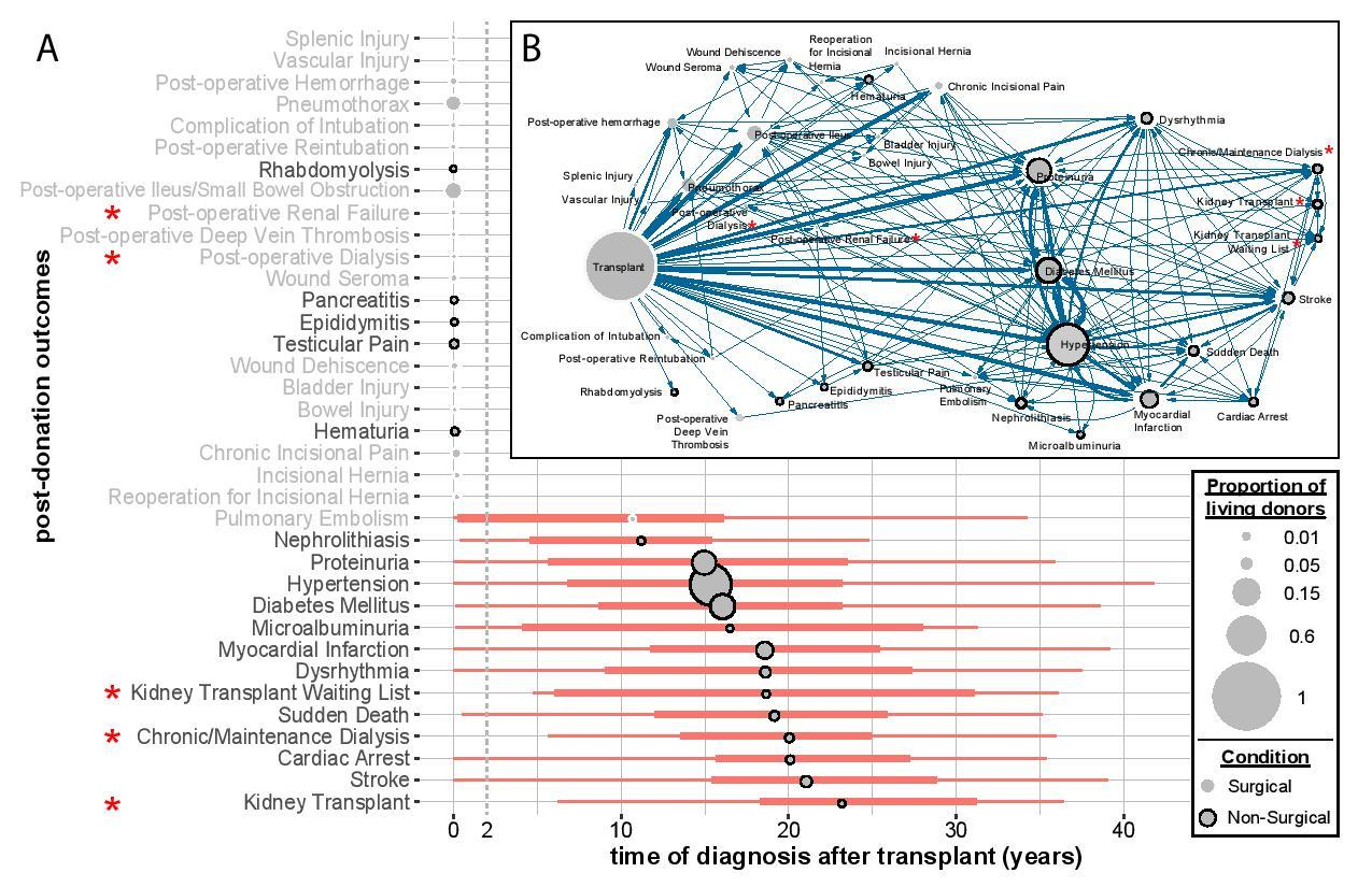
(A) This figure shows the range of times of diagnosis in LKDs, of 36 post-donation conditions (y-axis), over time (years) post-donation up to 40 years (x-axis). For each condition, the ends of the orange boxplots represent the first (leftmost end) and third (rightmost end) quartiles. Along the y-axis, the conditions listed in black, and the grey circles with black outlines correspond to post-donation outcomes that are non-surgical, whereas the conditions listed in grey, and grey circles without black outlines correspond to surgical complications, which occur typically within 1-2 years after transplant. The conditions on the y-axis are arranged in increasing order of median number of years of diagnosis of that condition. The position of the grey circles represents the median number of years for LKDs to be diagnosed with the conditions. Also, the size of the circles represents the relative proportions of LKDs with respect to 1,401 LKDs with at least one post-donation condition, which corresponds to the 'transplant' circle in the network in 3B and the size of the circle marked '1' in the legend.
(B) Using all 36 conditions and the temporal information shown in A, we construct a directed network. Each node is a condition, with the definitions of the size, color and outline of the circles mirroring those in (A). We start with the time of transplantation as the leftmost black node. The nodes are ordered horizontally according somewhat to the mean time of diagnosis. We observe that most of the surgical complications (grey circles without outlines) are nearer to the time of transplant and are also smaller in size than non-surgical conditions (grey circles with black outlines). Each node is connected to another by an edge in a directed manner, i.e. if event X precedes event Y, a directed edge is drawn from X to Y. However, the length of the edge has no meaning here. The thickness of the edges indicates the number of LKDs that has event X and then followed by event Y. The three largest grey nodes are hypertension, diabetes mellitus and proteinuria. Conditions associated with 'renal failure' are marked with red asterisks.

Trajectory Network of Postdonation Clinical Observations of Living Donors in Renal and Lung Living Donor Evaluation Study
Relative lengths of edges not drawn to scale. Edge thickness indicates the number of living kidney donors who have event X followed by event Y. 18 conditions are associated with Non-surgical observations.